I walked into a new local restaurant last month—exposed brick, Edison bulbs, the works. Super-nice vibe. Then I opened the menu.
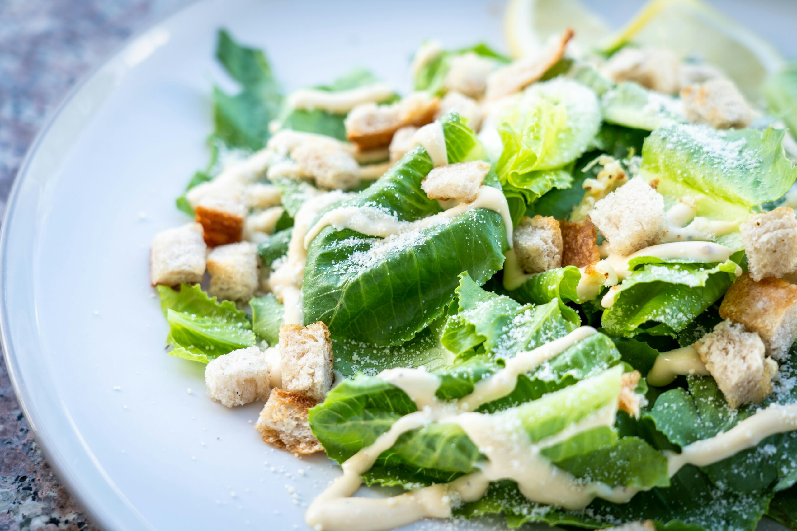
Ceasar Salad with Parmesean Cheese………. $8.00
My heart sank. Here was a restaurant that very clearly cared about ambiance, service, and (I hoped) food quality, but their menu screamed “we don’t sweat the details.” In one dish description, they’d managed to misspell Caesar, Parmesan, AND use the dreaded dot leader and double-zero pricing that makes everything feel cheap.
That menu killed my confidence before I’d even ordered an appetizer.
Here’s the brutal truth: customers judge your entire operation by your menu. It’s often their first real interaction with your brand, and first impressions are nearly impossible to overcome. A sloppy menu suggests sloppy everything else.
Let’s walk through the most common menu mistakes that make customers question your professionalism—and show you exactly how to fix them.
Mistake #1: The Spelling Disaster Zone
Nothing says amateur hour quite like a menu riddled with typos. But we see it constantly! One local place had FIFTY-FOUR typos on its menu (no, not a typo). I left them my card, but they never took me up on a proofread. Examples:
- Friend instead of fried
- Hiney mustard instead of honey mustard
- Bruscheta instead of bruschetta
- Cumcumber instead of cucumber (seriously)
Why This Kills You: Customers assume that if you can’t spell Caesar, you probably can’t make one either. Spelling errors suggest carelessness, and carelessness in the kitchen is the last thing anyone wants to imagine.
The Fix: Invest in professional proofreading. Yes, even for your “simple” menu. Spell-check won’t catch “flower” instead of “flour” because it’s a real word (just not the one you want). You need human eyes that understand culinary terminology.
Pro Tip: Much like big corporations do, create a house style guide. Is it mac and cheese or mac & cheese? BBQ or barbecue? Consistency matters as much as correctness.
Mistake #2: The Adjective Avalanche
Our signature slow-roasted, locally-sourced, grass-fed, organic, artisanal, handcrafted beef burger made with love on a toasted brioche bun with aged Vermont cheddar, farm-fresh lettuce, vine-ripened tomatoes, red onion, and our house-made special sauce.
Stop. Just stop.
Why This Kills You: Excessive adjectives don’t make your food sound better, they make your descriptions sound desperate. Customers start rolling their eyes instead of salivating.
The Fix: Follow the Rule of Three. Use no more than three descriptive elements per dish, and make sure each one serves a purpose:
- One for preparation method (grilled, braised, wood-fired)
- One for quality/sourcing (grass-fed, local, imported)
- One for flavor profile (smoky, tangy, rich)
Better: Grass-fed beef burger with aged cheddar, LTO, and smoky house sauce on a brioche bun
Mistake #3: The Inconsistency Chaos
Page one calls them French Fries. Page two calls them Fries. Page three calls them Pommes Frites. Your white wine list alternates between Pinot Grigio and Pinot seemingly at random.
Why This Kills You: Inconsistency suggests you don’t know what you’re serving or, worse, you don’t care enough to get it right. Both are customer confidence killers.
The Fix: Create a terminology guide and stick to it religiously. Decide whether you’re upscale casual (pommes frites) or approachable (fries) and commit. Your menu voice should be consistent from appetizers through desserts.
Mistake #4: The Comic Sans Catastrophe (And Other Font Failures)
Y’all. I’ve seen menus in Comic Sans. I’ve seen headings that are unreadable all-caps script. I’ve seen menus where every dish is in a different font. I’ve seen menus with neon green text on hot pink backgrounds that could trigger seizures.
Why This Kills You: Your typeface choice communicates as much as your words do. Comic Sans says “Marge’s break room sign on the fridge,” not “professional restaurant.” Overly decorative fonts are impossible to read. Neon colors suggest you borrowed your design from a 1990s website.
The Fix:
- Stick to two typefaces: one for headings, one for descriptions.
- Choose typefaces that match your restaurant’s personality but remain readable.
- Use plenty of white space—cramped menus feel overwhelming.
- Test your menu in poor lighting (because restaurants are often dimly lit).
Mistake #5: The Wall of Text Terror
Some menus read like novellas. Others are so spare they tell you nothing. Both extremes frustrate customers.
The Wall of Text (aka food blogger recipe hell): Our pan-seared duck breast is sourced from a family farm in upstate New York where the ducks roam freely across thirty acres of pristine grassland, feeding on natural grains and enjoying the fresh air before being carefully selected by our chef who trained in Lyon, France, and who prepares each breast using techniques passed down through generations of French culinary masters, then serves it alongside purple potatoes that are harvested from our own organic garden, which we tend with sustainable farming practices that respect the earth while delivering the most flavorful vegetables possible, all accompanied by a cherry gastrique that combines fresh Michigan cherries with aged balsamic vinegar imported directly from Modena, Italy, where it’s been aged in oak barrels for a minimum of twelve years…
The Telegram: Duck Breast – $28
Why This Kills You: Walls of text overwhelm customers and make ordering feel like homework. Telegrams give customers no reason to pay premium prices.
The Fix: Aim for 15–25 words per description. Lead with the most important information (what it is), then add 2–3 compelling details (how it’s prepared, what makes it special).
Better: Pan-seared duck breast with purple potato gratin and cherry gastrique 28
Mistake #6: The Section Disaster
Your menu sections make no logical sense. You’ve got “From the Sea” mixed with “Pasta Dishes” mixed with “Chef’s Specials” mixed with “Things We Serve” mixed with… wait, what?
Why This Kills You: Confusing organization makes customers work harder to find what they want. The harder you make it, the more likely they are to just order something familiar (and probably cheaper).
The Fix: Organize sections logically and use clear, consistent headings:
- Start with appetizers/small plates.
- Group similar items together (all pasta, all seafood, all steaks).
- Use section names that customers understand.
- Consider the customer journey (what do they want to eat first?).
Mistake #7: The Allergy Information Afterthought
Nothing says “We don’t take food safety seriously” quite like ignoring dietary restrictions or handling them poorly.
Okay: Fine print at the bottom: “Please inform your server of allergies.”
Bad: No allergy information at all
Worst: Inaccurate allergy information
Why This Kills You: One in ten adults has a food allergy. Ignoring them means losing 10% of potential customers. Worse, mishandling allergies can literally kill people and destroy your business.
The Fix:
- Mark common allergens clearly (but don’t clutter your menu; icons work great. Europe does this really well.)
- Train staff to take allergies seriously.
- Have accurate ingredient information readily available.
- Consider adding a few genuinely good gluten-free/vegan options.
The Menu Audit Checklist
Here’s your checklist. If you check more than two boxes, your menu needs professional help:
□ Spelling errors anywhere on the menu
□ More than three fonts used
□ Prices ending in .99
□ Dollar signs prominently displayed
□ Descriptions longer than 30 words
□ Descriptions shorter than 10 words
□ Inconsistent terminology between sections
□ Confusing section organization
□ No allergy information
□ Comic Sans or other unprofessional fonts
□ Neon colors or poor contrast
□ “Market price” for anything other than truly variable items
Remember: your menu isn’t simply a list of food, it’s a marketing document, a brand statement, and a sales tool all rolled into one. Every element should work together to create customer confidence. Professional menus don’t happen by accident. They’re carefully crafted, thoroughly proofread, and regularly updated. They respect both the food and the customer.
Your food might be amazing, but if your menu suggests otherwise, customers will never find out. Don’t let amateur hour mistakes undermine everything else you’e doing right.
The Bottom Line
I went back to that local haunt with the “Ceasar Salad.” The food was actually excellent—creative, well-prepared, reasonably priced. But I almost didn’t find out because their menu made me doubt everything.
Don’t be that restaurant. Your menu should make customers more excited to order, not less. Every word, every price, every design choice should build confidence rather than erode it.
Professional menus are investments. And unlike most investments, this one pays dividends with every single customer who walks through your door.